Components of time series#
import numpy as np
import matplotlib.pyplot as plt
%matplotlib inline
Introduction:
The four components of time series, we will consider here, are the trend, seasonality, offset, and noise (white/colored). We use simulated data to show these components here. The observation equation of time series should have the following mathematical representation:
where
\(y_0 \): intercept (e.g. in mm)
\(r\): is the rate (e.g. in mm/day)
\(a\) and \(b\) are the coefficients of the periodic signal
\(\omega_0\) is the frequency of signal (e.g. cycle/ day)
\(o\) is the size of the offset at time instant \(t_k\)
\(u_k(t)\) is the unit step function which is 1 if \(t_k \leq t\) and 0 otherwise
\(\epsilon(t)\) is the random noise with a given variance which follows a Normal distribution: \( \epsilon(t) \sim \textbf{N}(0, \sigma^2)\)
Here, we are assuming only a single seasonality and offset component. However, in many practical scenarios, there could be multiple components related to these.
Exercise:
You can simulate your time series based on the priori information provided in the scripts. Plot your results and change the input variables to see the effect.
The noise follows a normal distribution: use np.random.normal in order to draw random samples from a normal (Gaussian) distribution. Study more for this function here.
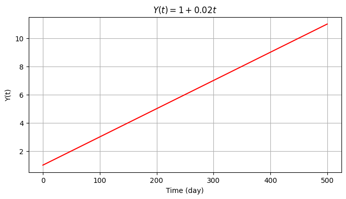
We will first create the time series \(Y(t)=y_0+rt\), with \(y_0=1\) mm and \(r=0.02\) mm/day with a duration of 500 days (i.e., time series consists of 500 observations).
np.random.seed(0)  # For reproducibility

time = np.arange(501)
m = len(time)
y_0 = 1
r = 0.02
y1 = y_0 + r*time

plt.figure(figsize=(8,4))
plt.grid()
plt.plot(time, y1, color='red')
plt.ylabel('Y(t)')
plt.xlabel('Time (day)')
plt.title('$Y(t) = 1 + 0.02 t $');
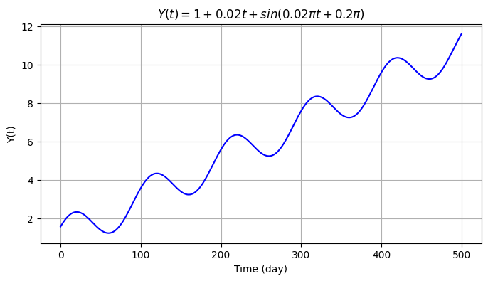
We then introduce seasonality to the data with a sine signal \(s(t)=A sin(\omega t + \phi_0)\) with \(\omega=2\pi f\), frequency \(f=0.01\) cycle/day (i.e., 1 cycle per 100 days), amplitude \(A=1\) mm and initial phase \(\phi_0=0.2\pi\) rad.
omega = 2 * np.pi/100
A = 1
phi_0 = 0.2*np.pi
y2 = y1 + A*np.sin(omega * time + phi_0)

plt.figure(figsize=(8,4))
plt.grid()
plt.plot(time, y2, color='blue')
plt.ylabel('Y(t)')
plt.xlabel('Time (day)')
plt.title('$Y(t) = 1 + 0.02 t + sin(0.02πt + 0.2π)$');
Text(0.5, 1.0, '$Y(t) = 1 + 0.02 t + sin(0.02πt + 0.2π)$')
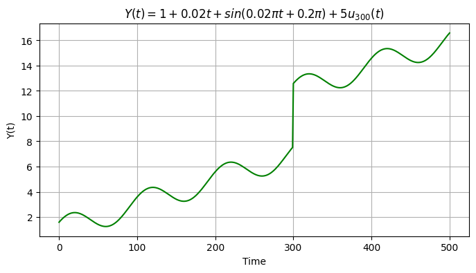
We now add an offset \(o_k=5\) at \(t=300\) days. We therefore create a copy of the previous signal and store it into a new array.
t_k = 300
O_k = 5
y3 = y2.copy()
y3[t_k:] = y3[t_k:] + O_k

plt.figure(figsize=(8,4))
plt.grid()
plt.plot(time, y3, color='g')
plt.ylabel('Y(t)')
plt.xlabel('Time')
plt.title('$Y(t) = 1 + 0.02 t + sin(0.02πt + 0.2π) + 5 u_{300}(t)$');
Text(0.5, 1.0, '$Y(t) = 1 + 0.02 t + sin(0.02πt + 0.2π) + 5 u_{300}(t)$')
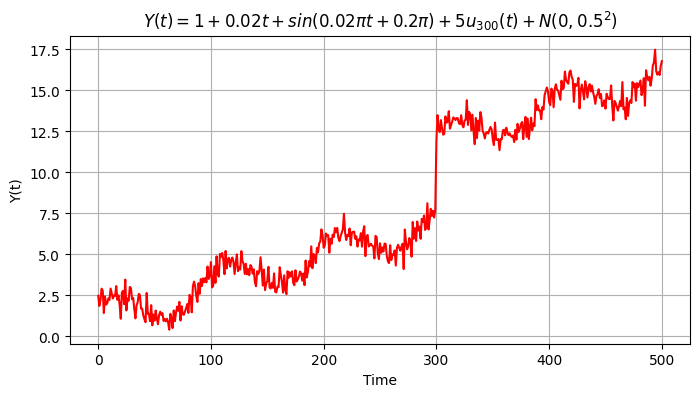
Eventually we include the random error \(\epsilon \sim \textbf{N}(\mu, \sigma_e)\) with \(\mu=0\) mm and \(\sigma_e=0.5\) mm.
mean = 0
sigma = 0.5
et = np.random.normal(loc = mean, scale = sigma, size = m)
y4 = y3 + et

plt.figure(figsize=(8,4))
plt.grid()
plt.plot(time, y4, color='red')
plt.ylabel('Y(t)')
plt.xlabel('Time')
plt.title('$Y(t) = 1 + 0.02 t + sin(0.02πt + 0.2π) + 5 u_{300}(t) + N(0,0.5^2)$');
Text(0.5, 1.0, '$Y(t) = 1 + 0.02 t + sin(0.02πt + 0.2π) + 5 u_{300}(t) + N(0,0.5^2)$')